The Big Fish in the Big Pond
Methodist Health System
For nearly 100 years Methodist Health System has been providing the highest quality care to North Texas. They’ve become the premier choice for many Texans and have grown to be one of the primary healthcare providing organizations in the state.
They launched a successful website 3 years prior, but over time noticed how the previous design locked them into an extremely inflexible design system. This made it difficult to appease internal stakeholders and cost them financially over time when they needed to continue building custom templates for one-off design fixes. It was clearly time to take a long hard look at the full strategy and rebuild the site in a future-proof state that avoids the pitfalls they were encountering.
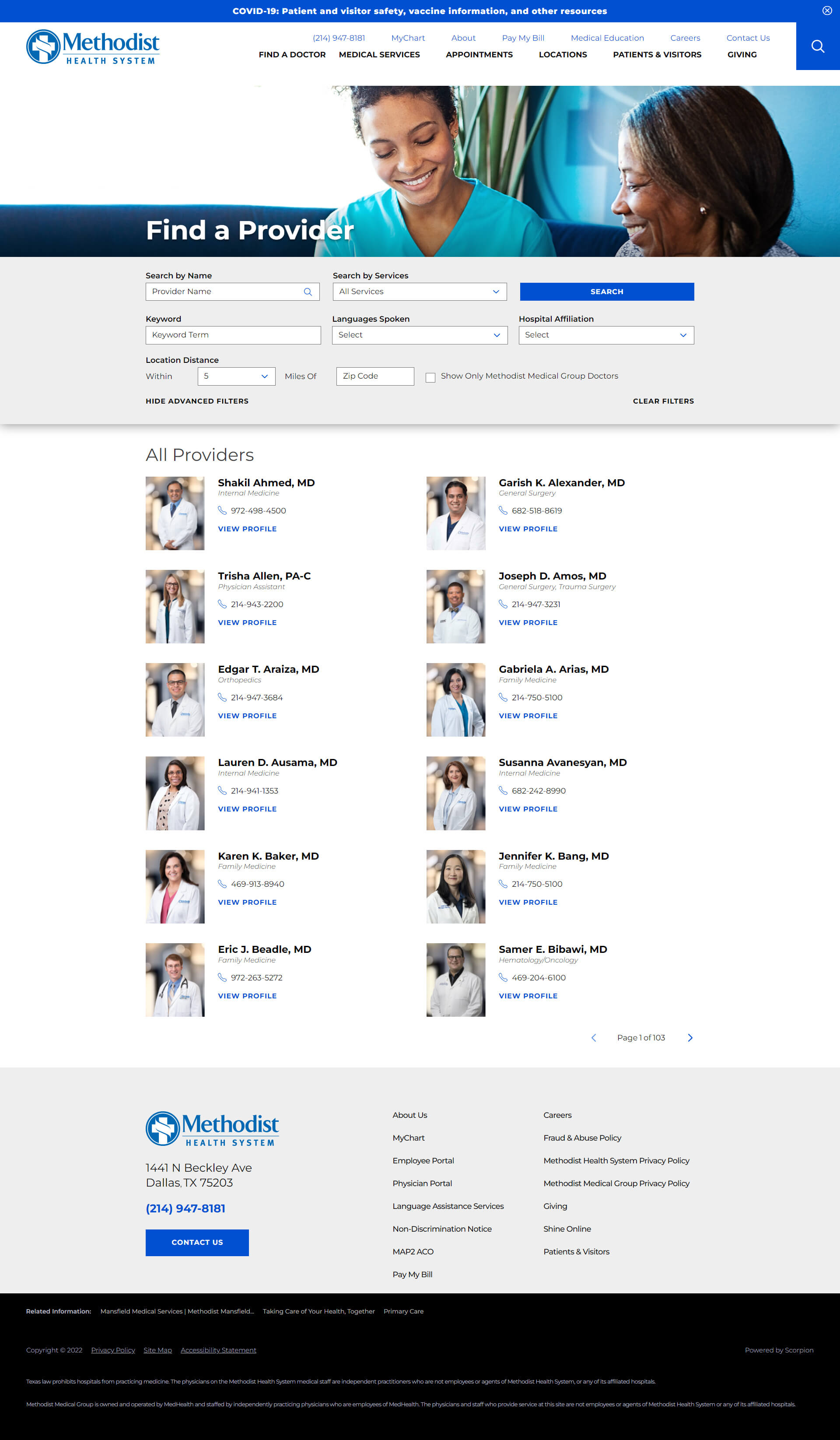
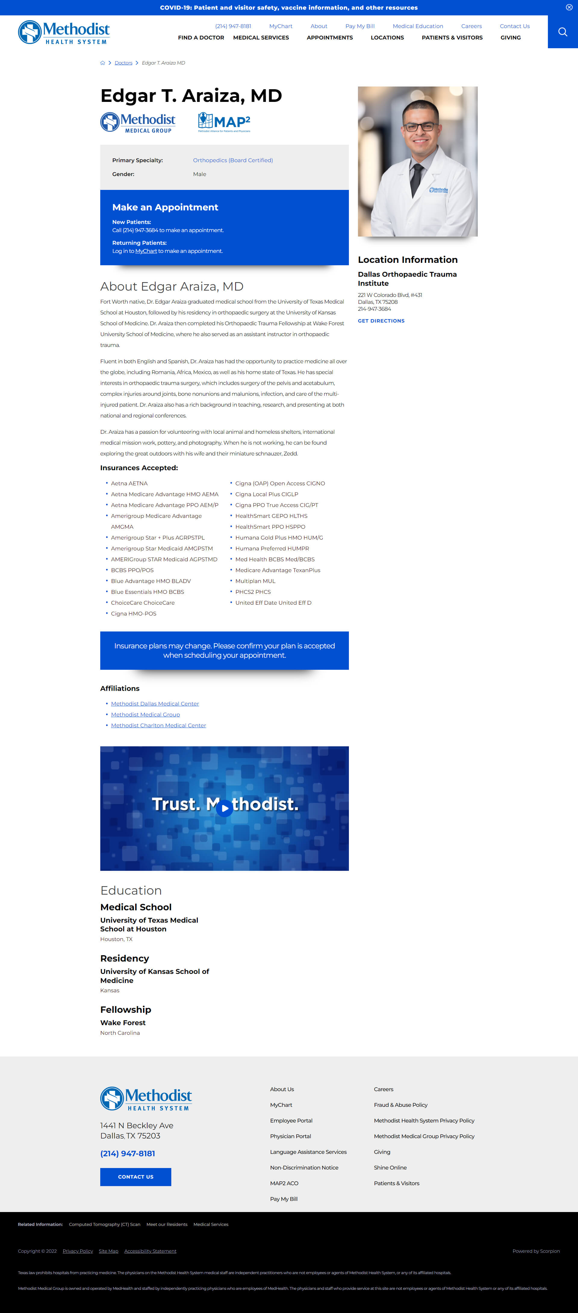
Designing a website that can represent the care given by over 1,200 doctors across 103 locations is a daunting task for everyone involved, client included. This project took nearly a full year, and was a massive collaboration between our teams, but the end result was incredibly successful for everyone.
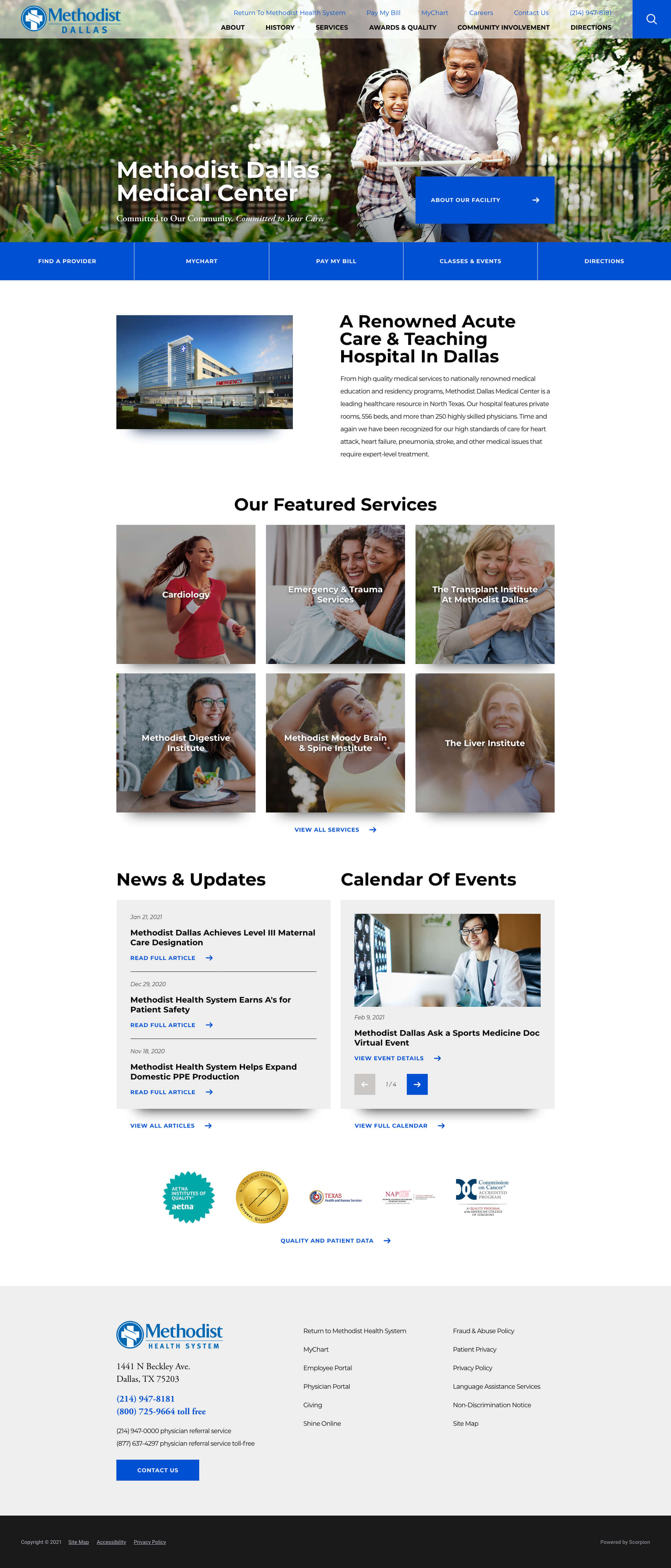
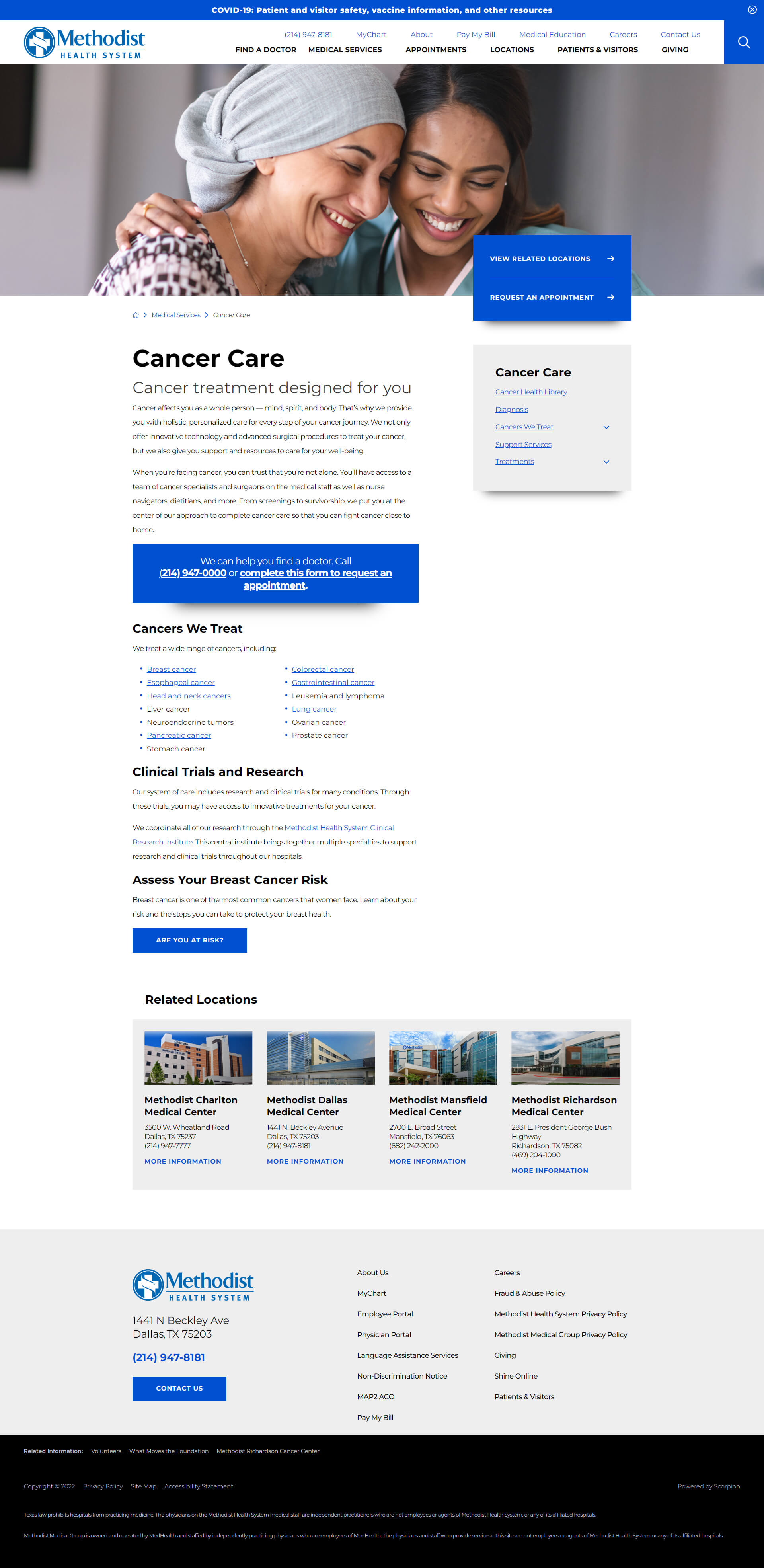
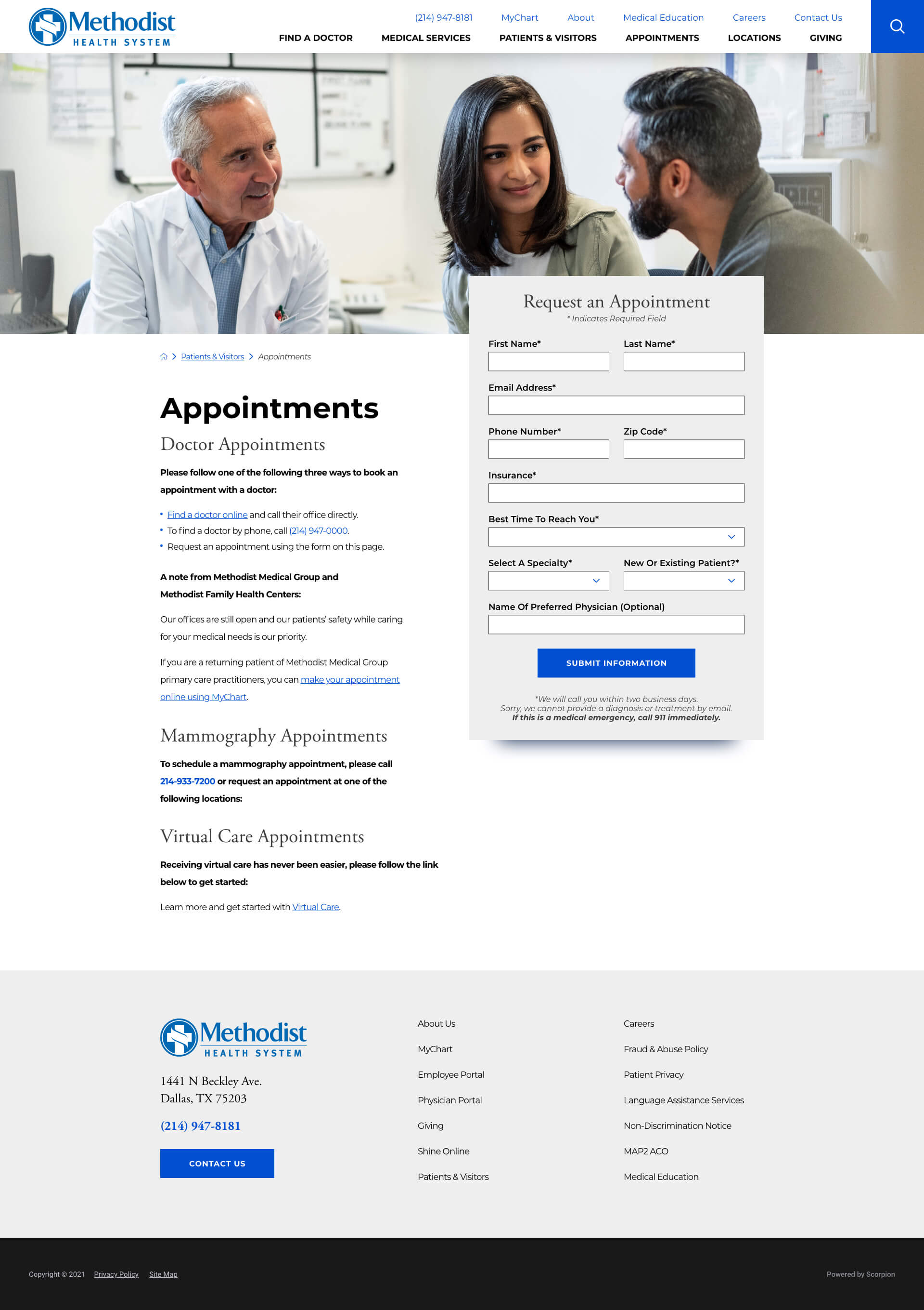
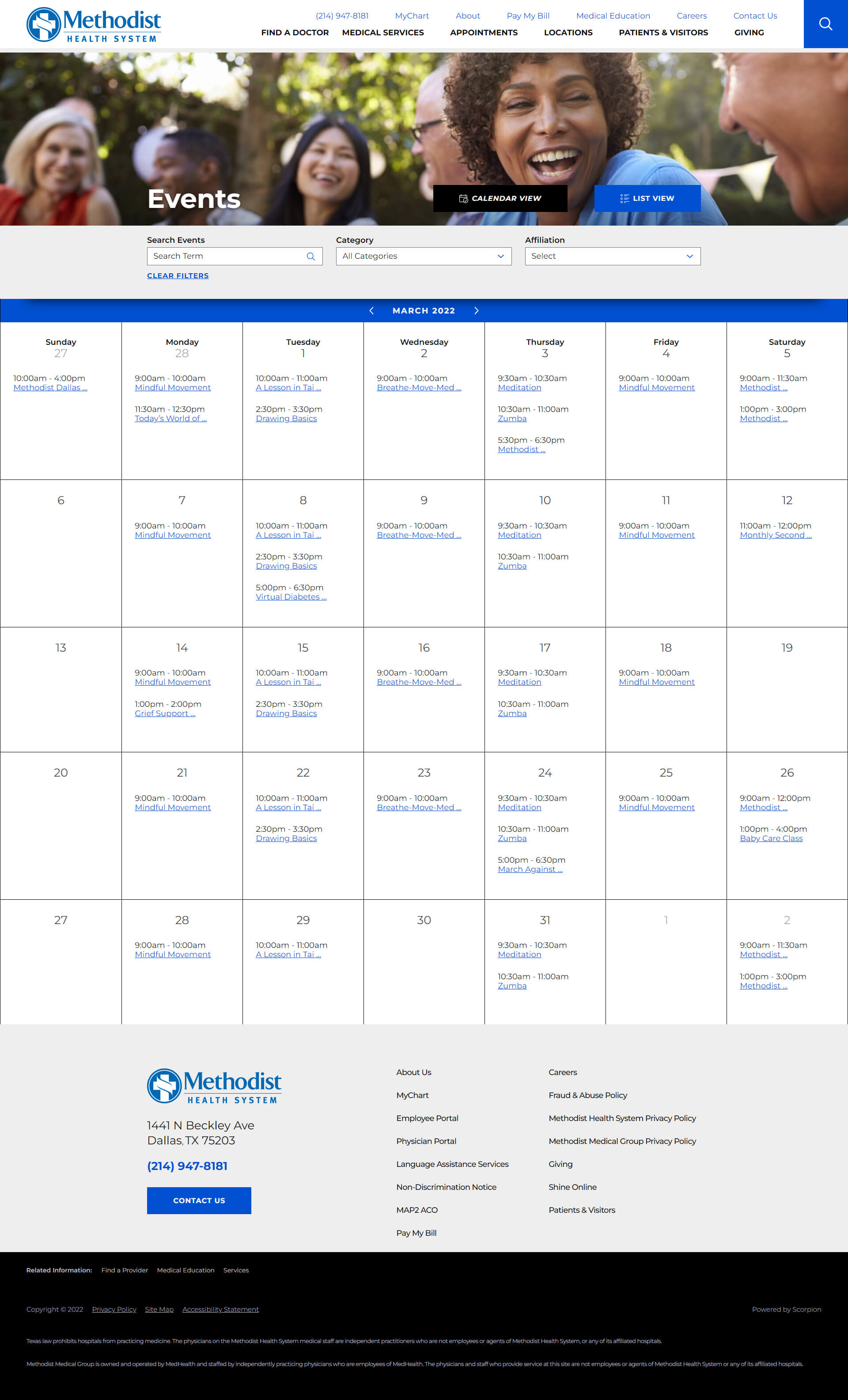
We created a new design system that allows for the shuffling of panels, reordering of items, and addition of announcements or new rich media snippets solving for all possible issues that could come their way. When crafting the template with which to build hospital location home pages, we crafted 25 unique panels to pull information from any direction that could all be assembled in whichever fashion needed so that each location can have a completely unique approach. This allowed maximum flexibility while allowing the corporate marketing team the quality control over the top level templates and design systems.
After a lengthy discovery phase that included many interviews, wireframes, and moodboards, the folks at Methodist were elated to approve the new site design during the first round of review. On a project this scale, that cuts several months out of an already elongated timeline which benefits everyone involved.


